Tabs
A tab holds one tiled arrangement of blocks — terminals, file previews, widgets, and so on. Every workspace can have any number of tabs, and each tab keeps running independently: switching away from a tab does not stop its terminals or interrupt any work in progress.
The tab bar
The tab bar runs across the top of the window. From left to right it shows:
- A menu button (only on Windows/Linux, and only when the native menu bar is hidden in
window:showmenubar) that opens the application menu. - A Home button that opens the Hosts and Vaults overlay on top of the current tab.
- Right-click Home for the workspace menu; it is not a separate tab-bar button.
- The tabs themselves.
- An Add Tab (
+) button. - An update-available banner (when a new version has been downloaded), a configuration-error
button (only shown while
settings.jsonor another config file fails to parse — click it to see which file and what the error is), and the account menu.
Clicking a tab switches to it immediately; the previous tab's blocks stay mounted and keep
running in the background. Tabs default to 130px wide and shrink as low as 100px to fit more of
them; once they hit that minimum width, the tab bar becomes horizontally scrollable instead of
shrinking further — drag anywhere on the bar to scroll, or use the scrollbar that appears on
hover. Clicking any tab while the Home overlay is open closes that overlay first, the same way
pressing Escape does.
Creating a tab
Click the + button at the right of the tab bar, or run New Local Terminal (tab:new). The
new tab is immediately focused and starts with a three-block starter layout: a system-info panel,
a terminal, and a file preview of your home directory, stacked so the terminal is focused. New
tabs are named T1, T2, T3, and so on in creation order until you rename them, and they pick
up whatever background preset is currently set as the default.
Renaming a tab
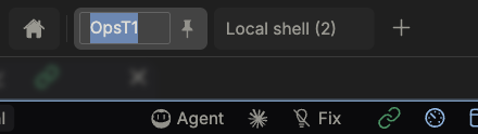
Double-click a tab's name, or right-click the tab and choose Rename Tab, to make the name
editable in place; the existing name is selected so you can start typing right away. Press Enter
to confirm, Escape to revert to the previous name, or click elsewhere to commit your edit (an
empty name reverts automatically). Names are capped at 14 glyphs while editing — counted so that
an emoji or a CJK character still counts as one, not several.
Reordering tabs
Click and drag a tab to a new position in the bar. Other tabs shift out of the way live as you drag, and the new order is saved as soon as you release.
Pinning a tab
Pinning keeps a tab from being closed by accident. Right-click a tab and choose Pin Tab, or drag a tab to the left of the leftmost pinned tab — dragging a pinned tab past the last pinned position unpins it the same way. A pinned tab's close button is replaced by a pin icon; clicking that icon unpins the tab. A pinned tab also can't have its last remaining block closed — you have to unpin it first.
The first tab in a brand-new window is pinned automatically.
Closing a tab
Hover a tab and click its close button, right-click it and choose Close Tab, or run Close tab (tab:close) to close the current tab. You'll see a confirmation
dialog — "Close tab? All blocks in this tab will be closed." — before anything is discarded, and
the action can't be undone. Closing every block inside an unpinned tab (one at a time, from the
block's own close button) closes the tab automatically once it's empty.
A workspace always keeps at least one tab: closing the only remaining tab is a no-op everywhere (the tab bar, the keyboard shortcut, and the pinned-tab spam-close case all check for this).
Switching tabs
Click a tab or use previous/next, indexed-tab and last-tab actions. Recommended and Termius presets can differ; Windows/Linux use the action registry's Ctrl combinations, not the old Alt mapping. See Key Bindings for the effective table.
Right-click menu
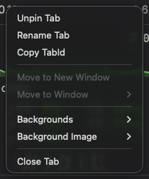
Right-clicking a tab shows:
- Pin Tab / Unpin Tab
- Rename Tab
- Copy TabId
- Backgrounds — a submenu (see below)
- Close Tab
Tab backgrounds
Every tab renders a background layer behind its blocks — a gradient or color that's always translucent, never a solid fill, so the block surfaces on top of it stay readable in both light and dark mode. Right-click a tab and open Backgrounds to override just that tab's background with one of the shipped presets; the current one is shown with a checkmark. The submenu only lists presets that match the app's current light/dark mode (presets without a mode restriction, like the default, are always shown), so you never end up picking a dark gradient while the rest of the UI is in light mode.
Choosing Default clears the tab's own override and falls back to whatever background is
configured globally (the tab:preset setting, changed from the Appearance settings tab). Picking
any other preset here only affects the tab you right-clicked — it does not change the app-wide
default.
For what a background preset actually contains, how the 25 shipped presets are organized, and how
to add your own, see Presets. For the Appearance settings tab, per-tab image
backgrounds, and the wsh setbg command, see Customization.
Related
- Workspaces — how tabs are grouped and persisted
- Layout — arranging, splitting, and resizing the blocks inside a tab
- Widgets — the kinds of content a block can hold